Five months ago, I packed up my life in Baltimore, MD and moved across the country to start as an Assistant Teaching Professor at UC San Diego in the Cognitive Science department. A few hours ago, I gave my last lecture of the quarter in my first course here. This is a postmortem of that course…before I see student evals.
First, a bit of background: I spent my first two months here talking to people trying to figure out as much as I possibly could about UCSD, the students, the courses they take, and most importantly about how the courses I’d be teaching have been taught historically. I met with faculty, staff, and grad students in the department, instructors of the courses students tend to take after mine, other new Assistant Teaching Professors in other departments, and most importantly, Brad Voytek - the developer of COGS9 (the course I’d be teaching) and person who has taught it since 2014…among doing many other awesome things - and Tom Donohue - Teaching Assistant & Graduate Student Extraordinaire - who knows the course inside out and backwards and who contributed to its development and success.
The Course
Brad has previously written about COGS9 in his super interesting and thoughtful blog post Data Science at UC San Diego, but very briefly here, COGS9 is an intro level course designed to get undergraduate students interested in data science, familiar with what data science is, and excited to learn more. It is neither math nor computationally-heavy, but is rather taught through concepts and examples. When it first ran there were 24 students. Now, each time it is offered, there are hundreds. This quarter, when numbers settled out, I had 326 students in the course.
Course Design
Not every professor is willing to hand over all their teaching materials and even less frequently are those materials well-organized and clear. Thankfully, from Brad, I had his materials and a clear understanding of how the course had been structured previously. Additionally, thanks to the fact that UCSD gives instructors the option to podcast their courses, I was able to listen to parts of lectures that Brad had given in this course previously to get a sense of how the lectures are structured and the pace of the course .
With that in mind I sat down to consider how I’d run this course. Brad and I were certainly on the same page in that we agree that:
- Being a good person and acting ethically as a data scientist is really important.
- Students lacking a background in programming & math shouldn’t be weeded out of the field before they have a chance to learn these things.
- This course is not meant to be the hardest course they take this quarter, but it is supposed to be interesting and teach them about data science.
My goal was not to change what Brad had built too much, but to make sure that it worked for my teaching style and students. I altered a few things from how Brad had run things but left the course largely similar.
The syllabus for this course can be viewed here, but very briefly, the way I laid out the course topics was to walk through a data science project.
- The first third of the course focused on data science questions, getting data, and data wrangling.
- The middle part focused on descriptive and exploratory data analyses along with data visualization.
- And the final third of the course walked through the basic types of analyses, including inference, prediction, text analysis, and geospatial analysis.
Additionally, we had two guest lectures. The first was Page Piccinini, who talked about her work as a Senior Data Scientist at Classy. Our second was Sean Kross, who discussed approaches to getting into the data science field as an undergraduate. Both were awesome!
What Worked Well
- Ethics - I moved ethics to the beginning of the course. (I’m talking day 2…the day after we discuss the syllabus and what data science is). I started with a few clicker questions to see student’s initial thoughts on a few ethical situations. I repeated these at the end of the lecture to see how opinions changed after the lecture (I shared these results with them on the next lecture day…as a way to show data & remind them of our ethics discussion for a second lecture in a row). After iclicker questions, I went through bunch of examples of where big data & data science has lost their ethical way over the years (Equifax Hack, Criminal Sentencing, Strava revealing secret army bases, the Cambridge Analytica saga, among others). After these examples I discussed the ethics behind Facebook’s data being used experiment to see if what individuals see on their News Feeds affects their future posts (thanks, Brad!). Finally, I talked about the Belmont Report and the Common Rule - two topics which usually get filed away in the boring drawer - and students loved it (per mid-course survey) and remembered it (per exam response). I also had students consider the ethical implications of their data science projects, discussed ethics in at least four more lectures (hello, algorithms lecture!), and told them on the last day of class that if they remember anything from this class it’s to go and act ethically in the word. This may have worked well because it is a huge priority of mine. But, students really got into it. Slides available here.
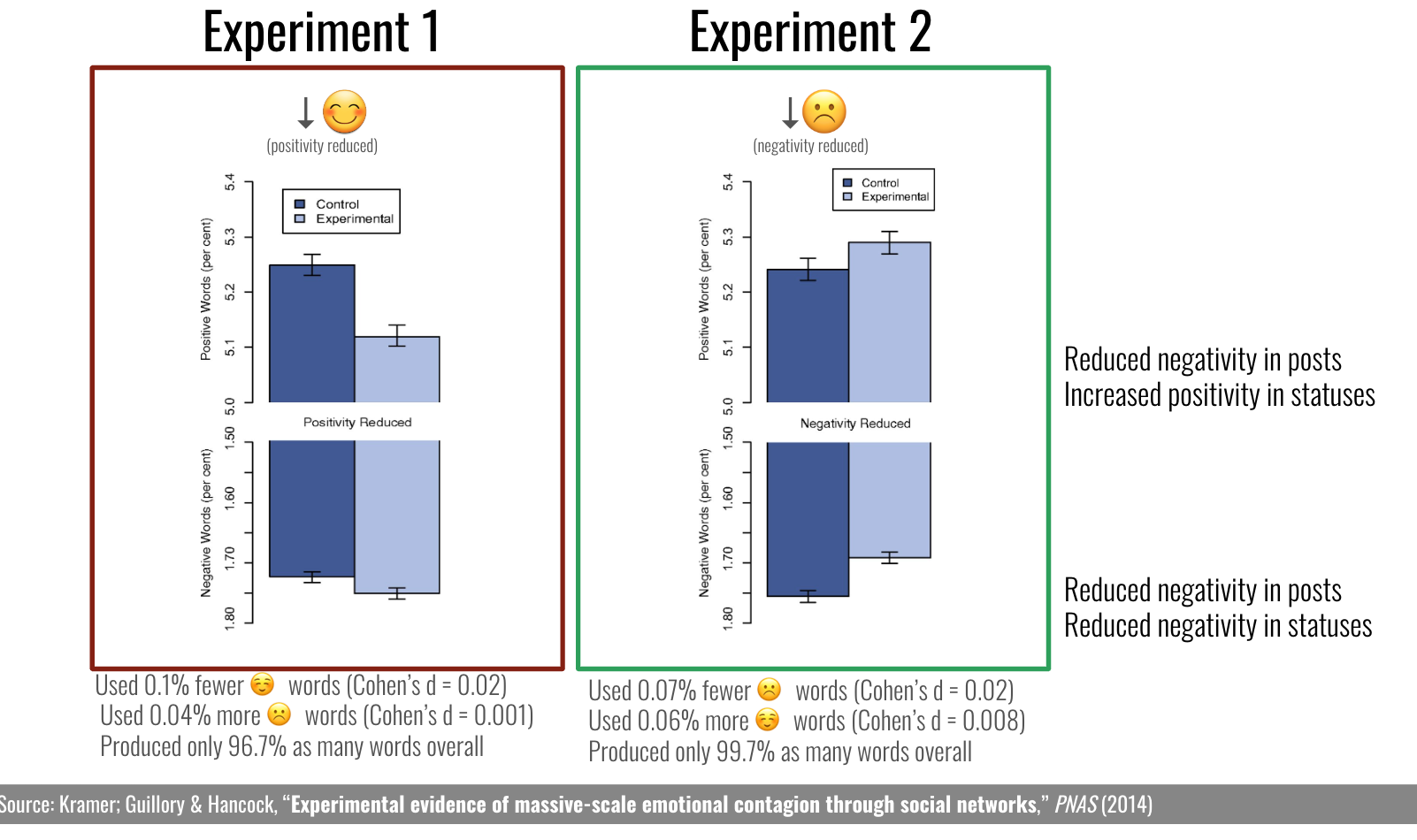 Figure 1: Slide from Ethics lecture explaining Facebook data experiment
- Visualization for Communication - I had two data visualization lectures in COGS9. The first covered the basic types of visualizations, when you would use each of them, and what elements must be clear on any visualization you make. That lecture was fine. The lecture students really got into and got a lot out of (per surveys) was the second lecture: “Visualization for Communication”. I relied heavily on examples from storytelling with data and presented students with sub-par visualizations and asked them to think about and chat with one another about how they would improve them (different type of plot? better title? remove the weird background?). Then, we discussed as a group and I displayed the improved visualization. It was the lecture with the most engaged students (as measured by the number of unique individuals raising their hands to answer a question) of the entire quarter. Slides available here.
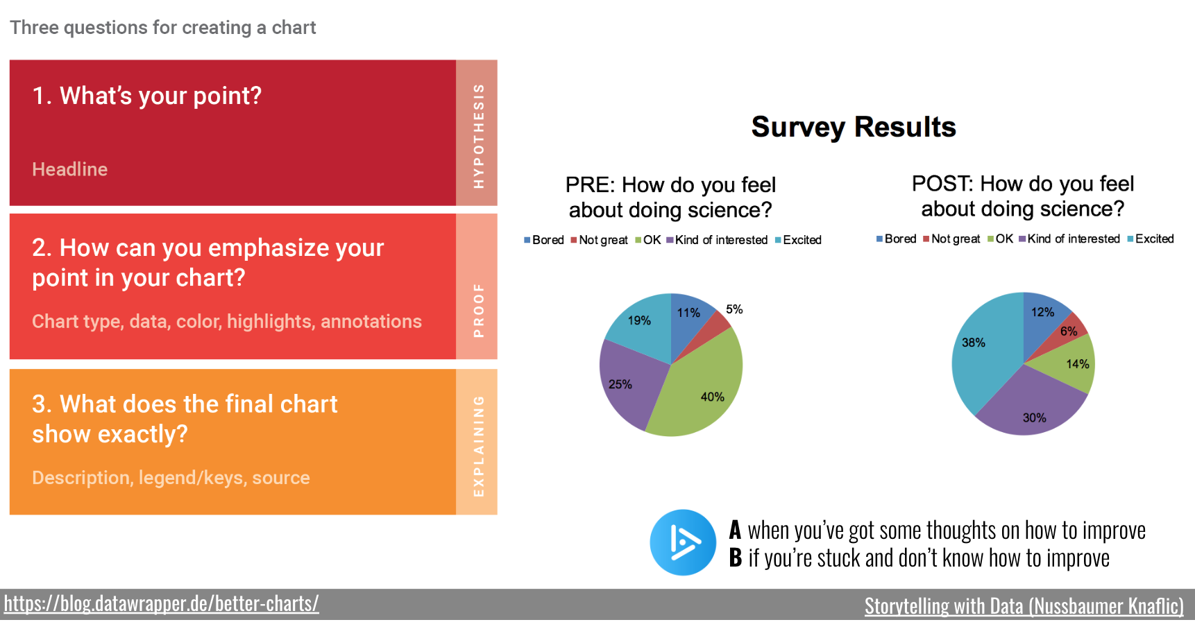 Figure 2: Slide from Visualization for Communication lecture used to get students talking
- Spotify text analysis - Y’all, I did the most basic analysis of pop music lyrics one could do to demonstrate sentiment analysis and TF-IDF (for the text analysis lecture) Thanks #tidytext. I don’t even know very much of anything about pop music today, and it went well. Let me tell you, I literally saw students sit up in their seats. Students that were slouched sat up. I don’t have data points on this, but that observation means something. It also was the lecture that had the most students come up to me after lecture to ask interesting and thoughtful questions about the analysis I had presented during lecture. Analysis I used (w/ code) in a forthcoming blog post, but lecture slides from that day are available here.
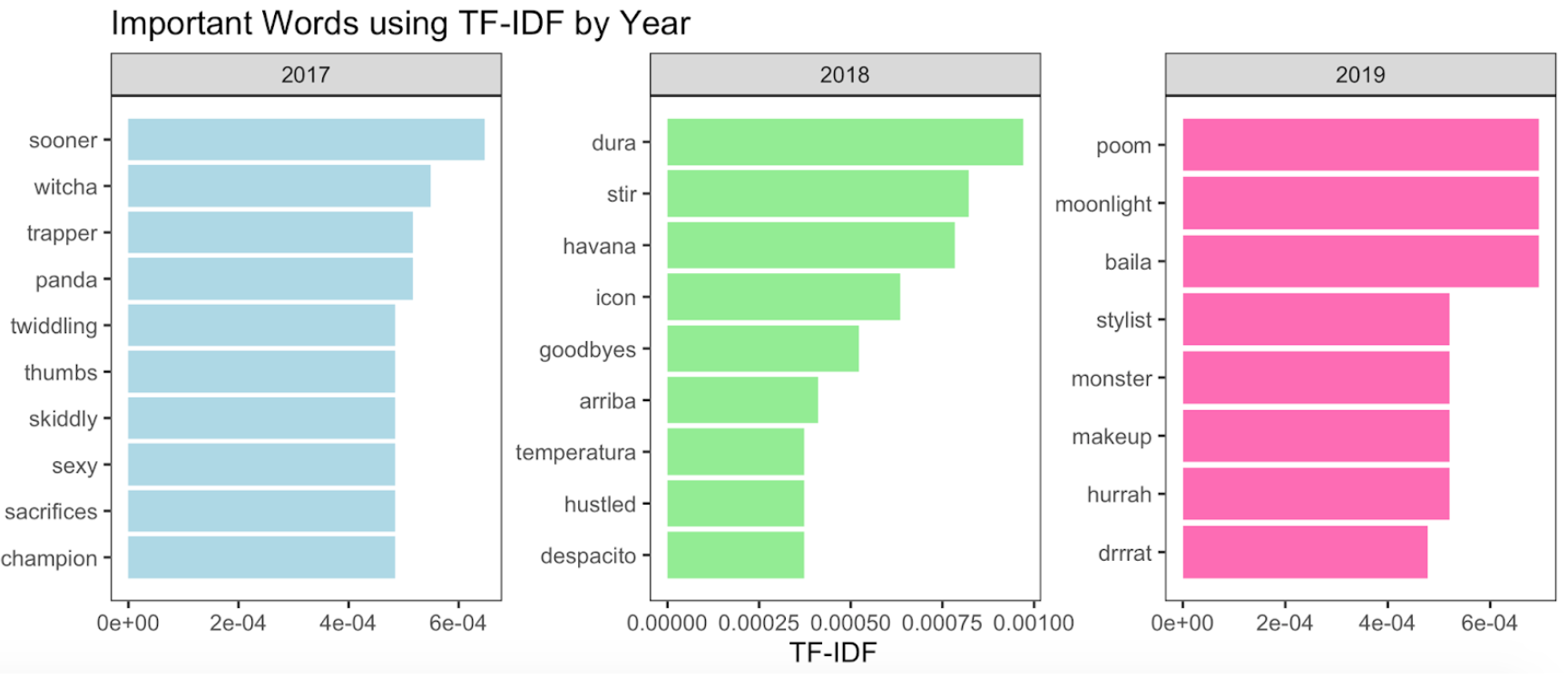 Figure 3: Image from silly pop lyrics Spotify analysis
What Worked Less Well
Suffice it to say, plenty of mistakes were made this quarter. In fact, I have a running list (currently up to 25!) of all the small slip-ups (whoops! Forgot to make that column in the gradebook visible to students…again), the things I’m working on (removing “You guys” from my vernacular), and the actual mistakes I made (let someone announce something before my class that was not UCSD-affiliated). But, specific to COGS9, there were three things that didn’t go great.
Group Project - I have 340 students. Group projects are almost a must. And, in data science, working with others is also a must. So, I like the the need for a group project. Additionally, some of the students’ group data science projects were stellar this quarter. But, I didn’t strike the right balance to ensure that each member was contributing and understanding. I’ve seen some creative approaches to this before from other instructors, but I think for the next time I teach this course, I’m going to require short group presentations of their projects as their final. For this, I’ll assign who is presenting which section on the day of the final. This way, everyone will at least have to understand what was done enough to explain it, even if they weren’t the one doing the coding and there will be a component assessing oral presentation (currently missing, but important for data scientists!). Additionally I used Colaboratory - Google’s version of a Jupyter Notebook. On paper, a great idea. In reality, it’s just not there as a technology yet for group work. Students weren’t able to see the changes other members of their group were making and thus lost out on the hope for collaboration that I had. I think Colaboratory will improve with time, but as it stands now, I wouldn’t use it again for group work.
Data Wrangling - This lecture was a dang snooze fest for all involved. My example was too boring, and the students couldn’t see the why behind what I was doing.This is a huge shame because I really want my students to know that data wrangling doesn’t have to be boring. Dropped the ball on that one! Going to make this a puzzle next time I teach it so that students have to propose what step is taken to wrangle an actual dataset. Details to follow…in approximately 8 months. Obviously, I’m not sharing these slides now (Kidding. Kind of. If you want them, let me know.)
Version Control - I was stoked for this lecture and topic. I had convinced myself that I wasn’t going to make git and GitHub confusing and that I’d just teach them what they needed to get started (hah!). I told them that while we weren’t going to use it in this course, they’d have this lecture and these notes to look back on. Yup, you heard that right, I taught version control and then didn’t have students freaking use it. What a wasted opportunity! In the future, I’m not sure if I’ll move this lecture to the more advanced data science course or keep it in here, but actually have students interact with git and GitHub to truly understand what I was up there blabbering on about. While this wasn’t great in the course, I think the slides could be helpful to someone else, so sharing them here.
What Students Thought of COGS9
Using the survey data I collected and iclicker responses, I’m going to summarize what students thought of the course in my next blog post. Following that, I’ll demonstrate how I weaved students’ data throughout the course and eventually write up the Spotify analysis post, in case anyone else wants to use it in class.