Let me start off by acknowledging that we are by no means the first people to ask which color palettes are best for graphing. Further, I fully admit that we entered into this quickly and did not read the literature thoroughly nor think through all the possibilities that one should consider when embarking upon a proper research project. Which, to be fair, is why this is a blog post (and not a paper).
Jeff and I probably aren’t even the first mentor and mentee to have the following disagreement discussion:
Shannon: Well, and this is not a sexist comment, males don’t differentiate colors as well as females.
Jeff: What? Yes, that is sexist!
Shannon: No, it’s not. It’s a thing.
Jeff: Are you sure?
Shannon: I think so…
Jeff: Let’s test it.
With that, the desires to (1) develop a “Leek Group” color palette and plotting style and (2) determine whether or not males and females discriminate colors equally well were born. And, so, we asked the internet to take a quiz.
Quiz Participants
After removing duplicate responses, keeping only the most recent response from any individual (nice try, you guys!), we had 426 responses from 198 females (46.0%), 219 males (51.8%), 1 nonbinary individual (0.2%), and 7 people who preferred not to say (1.6%).
Color Palettes
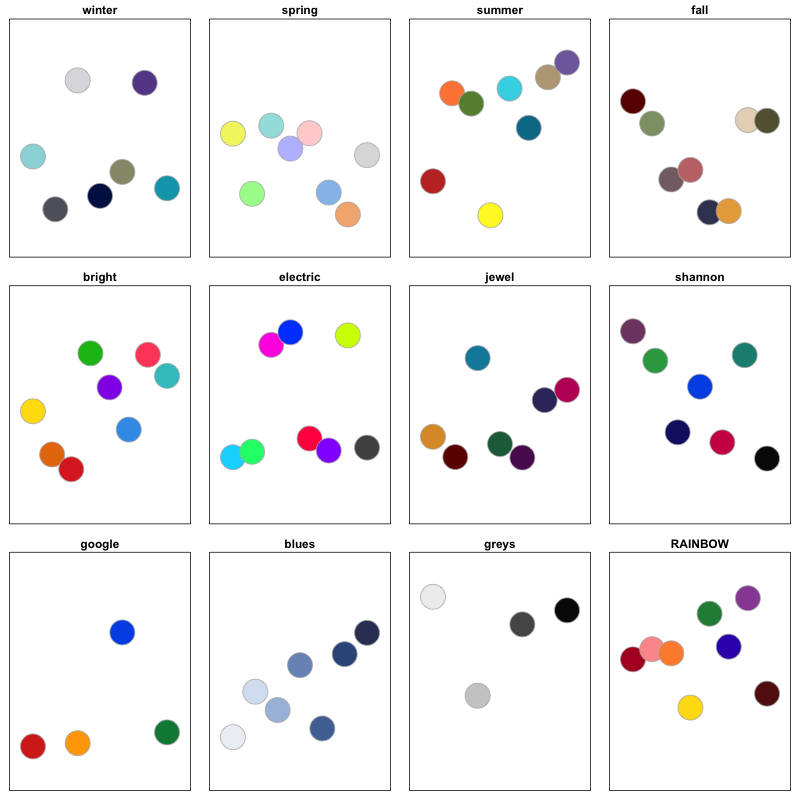
To remind those who took the quiz and catch the rest of you who didn’t up to speed, these were the color palettes being considered:

Results
Color Palette Preference

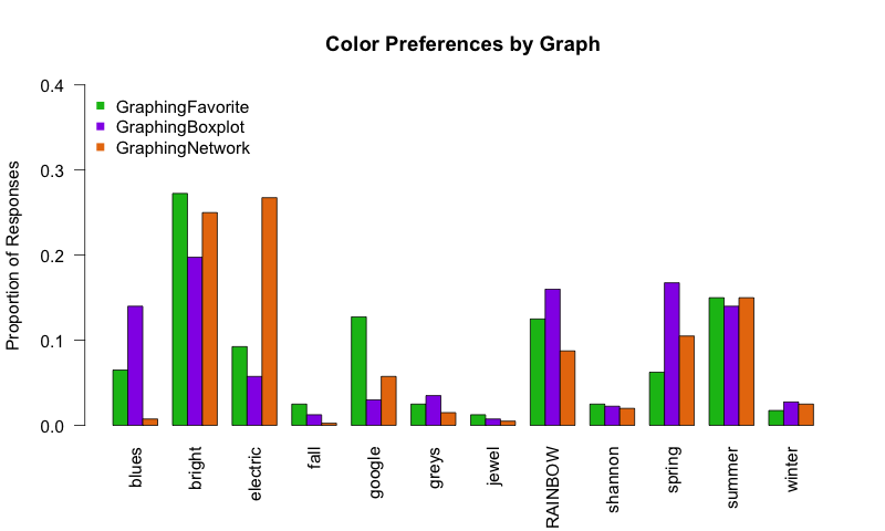
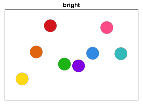
There was no overwhelmingly popular winner; however, the “bright” palette was preferred by the largest proportion of people for graphing generally (green above) and preferred by many when specifically applied to the boxplot (purple) and network (orange) figures presented. In group meeting this past week, it was suggested that the pink be “more pink,” and I thought that was a great suggestion, so, without further adieu, the Leek Group color palette will be “bright” (with slight pink adjustments):

As for the other plotting details for Leek Group graphs, you’ll just have to wait on the edge of your seats and see what Sean comes up with!
Color Preferences by Sex
Now…onto defending my honor.
First, when asked to select palettes in which all the colors included did not appear distinct at first glance, 25% of females and only 8.7% of males responded that all of the palettes appeared reasonably distinct (p<5e-05). Yes! Point Shannon.

However, when presented with three images of blue dots (above) and asked the correct number of distinct colors in each image, we got the following results:
<img src="/blog/images/Blues_mf.png", width = “100%”, height = “100%">
Note: the actual number of distinct colors is 5, 7, and 7 respectively.
As evident in the graphs above, when determining the number of distinct colors, there is no large difference between the sexes. But, I will break these results down anyway. In the middle plot, there is a tendency for females to get the correct answer (7) more often than men. However, this effect is attenuated in graph to the right in which more males see the correct number of distinct colors (7) and more females see more distinct colors than are actually there (8 and 9…¯\_(ツ)_/¯?). I guess I have to concede to Jeff. Here, there was no strong effect for color discrimination between males and females. Point Jeff.
Finally, while not about color discrimination, we did see sex preferences when broken down by color palette. Specifically, females showed the strongest preference (relative to males) for “bright”, “electric”, and “google” to males. Males, on the other hand had a preference for “spring” and “summer” relative to females.
Limitations
- Males are disproportionately affected by color-blindess, an effect not accounted for in this analysis.
- Color palettes could certainly have been chosen in a more scientific manner and were by no means unbiased. (I know. I know. I am sorry your favorite color palette was not included.)
- I received the following feedback from a friend: “i tried to do your google form about colors and i just ended up hating myself halfway through so i stopped.”” Needless to say, I have no formal training in survey development, which could have biased who responded to the quiz. In the same vein, apologies to any and all whose days were negatively impacted by this quiz! Thank you for suffering in the name of our curiosity!
A few remaining points to be made
- Clearly people have different preferences in how data are presented and in which palettes are most pleasing to their eyes. This is not surprising, but is certainly a conclusion supported by these data.
- Interestingly, when I posted the quiz to facebook, 75% of the 150 responses I received were from females. When Jeff Leek and Jeramia Ory (two male academics) tweeted this quiz out ~12 hours later, the response rate was disproportionately male. Again, while not wholly surprising, this is a discussion for another day.
- Thanks to everyone who was interested enough in colors or bored enough scrolling through social media to take our quiz and a special thanks to Alyssa Frazee, from whom I absolutely stole code from RSkittleBrewer to generate the color palette images on the quiz.
- Data and code to reproduce these analyses are on GitHub.